Monday 23 May 2011

Exam


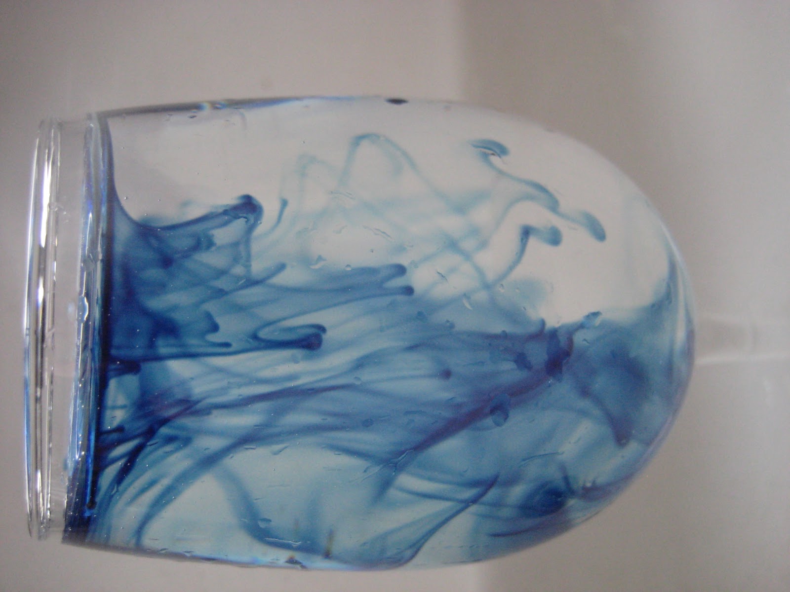
For my A Level Art exam this year my original idea was focusing on water. I was interested in looking at water and reflections of light in liquid and metal. I also wanted to try and photograph the movement of water, for example when it splashes up and catches the light. These are my first set of photographs, I found it hard to capture moments of movement without blurring. However when I slowed down the shutter speed it was easier to photograph the water with a better result. These are just a few of my photographs but I like the viscous quality that the water has, especially in the middle 4 photos.


Turner


As I chose a very fluid subject matter I decided to experiment with materials that could offer the same sort of easy movement. I started by working from my photos using charcoal, I found this easily blendable and quite effective in creating soft tones and changes in light. The downfall is that it is impossible to introduce colour into a charcoal drawing so I wanted to find a better method of portraying my photographs. In the second drawing I was focusing on movement from a small section of one of my photos, this drawing had similarities to some of Turner's paintings in the way it shows a section of abstract movement. However I wanted to pursue a more high realism style of painting.

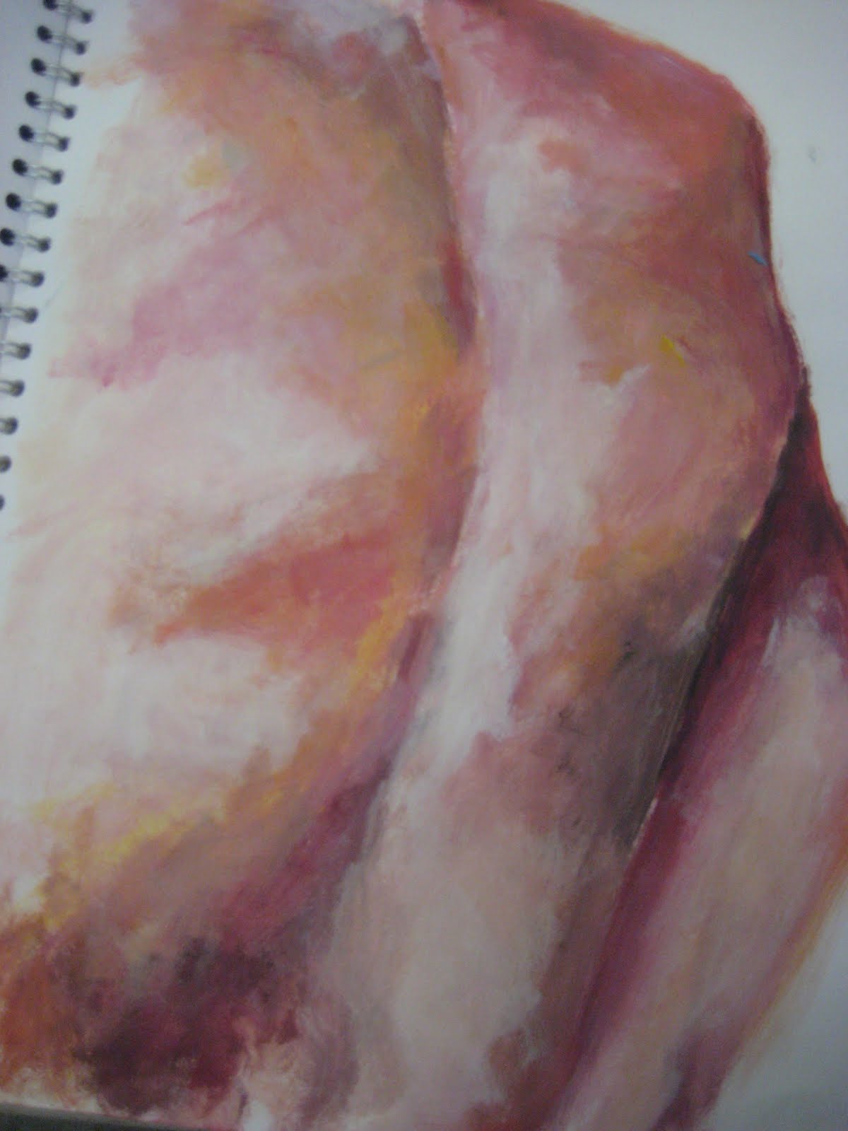
Moving on from charcoal I started to use oil pastels, I like the level of blending I achieved and the ability to introduce blues and yellows rather than just monotone. To improve this picture I should have used turps as this changes oil pastel into a thicker paint like consistency and would definitely improve the blending of colours.


Ricard Estes


Jason De Graaf

I researched high realism art history and found two artists that I was most interested in: Jason DeGraaf and Richard Estes. Both use light and reflections in their paintings. DeGraaf's work manages to capture moments of movement in water, which was exactly what I was aiming for with my own work. Estes' paintings are almost like visual phenomenon, they mix light with metal and reflections, another aspect I was interested in looking into.
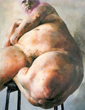
Rodin
Another artist I also looked at was Rodin, although his work is mostly sculpture, the way the bronze curves and reflects the light is not disimilar to some of my water photographs, so I attempted a tonal version in pencil of one of his sculptures.


I wanted to expand on my first set of photos as I felt I had gone as far as I could, so I experimented with the idea of visual phenomenon. Instead of focusing on moving water this time I decided to try capture the movement of food dye in water. I found when I photographed this upclose that it produced great abstract shapes but still had the fluidity I wanted.


I experimented with different ways to best portray my subject matter. When I was working on a smaller scale I realised I needed to use materials that could offer precision as the dye in my photos is very defined. I tried using biro however it didn't offer the ability to blend that I would have liked so I moved onto oil pastel pencils which I liked as they meant I could get both of these aspects. I also did a close up section in acrylic paint, this lead me to the conclusion that my final piece would need to be on a large scale to look effective as I found it almost impossible to paint the detailed dye and water so small.

This is my final exam piece. Overall I am pleased with the outcome however I encountered several problems along the way. The main aspect I struggled with was the time constraints of the exam, because I used acrylic paint it meant I had to build up layers of colour before I could get started with the deatil, and as I chose to do it in a high realism style this also took a long time. If I had had more time I would have concentrated more on the detail of the full painting rather than just the blue dye. I a regret not using oil paints as I feel these would have offered more depth of colours than acrylic. Though I am happy with the finished painting and I think I managed to fulfil my orginal criteria if capturing water and movement.

Sunday 22 May 2011

Coursework


Jenny Saville
Jenny Saville 
Last year for my final exam I painted a still life, so I wanted to start my Year 13 course focusing on something completely different. I was interested in the portrayal  of skin and the body, so I looked the artist such Jenny Saville. I like the way that she manages to portray such a wide range of colours on the skin she paints.

This is my first attempt at a Jenny Saville  copy, because of using acrylic rather than oil paint I realised I needed to paint in lots of layers to build up the colour palette. I think oil paint gives skin a more 3-D quality. especially the way Saville uses it to accentuate the curves and rolls of fat in her figures.

Edward Hopper
Edward Hopper


I then decided to investigate different artists who look at the figure. Edward Hopper interested me because of the way he uses extreme light and shade to create shadows on the body but also emphasise the loneliness and isolation of the women in his paintings.
I took my own photographs in the style of Hopper, but found they were quite hard to stage as the photos I liked best used natural sunlight to cast shadows, which isn't always convenient.


I did a tonal pencil drawing from my photos, to try and display the subtle changes in light and shade. I think this method was effective but this subject matter meant that I was focusing more on the overall figure rather than skin, which is what I was most keen on exploring.